

Project Duration
3 Months
Role
Product designer
The Challenge/Problem:
Each year, the city of Recife faced significant challenges and poor outcomes during its public school enrollment process, largely due to a highly complex, non-mobile-optimized, and information-deficient online system. This created immense frustration and barriers, particularly for parents in lower socioeconomic classes, hindering their ability to secure educational opportunities for their children.
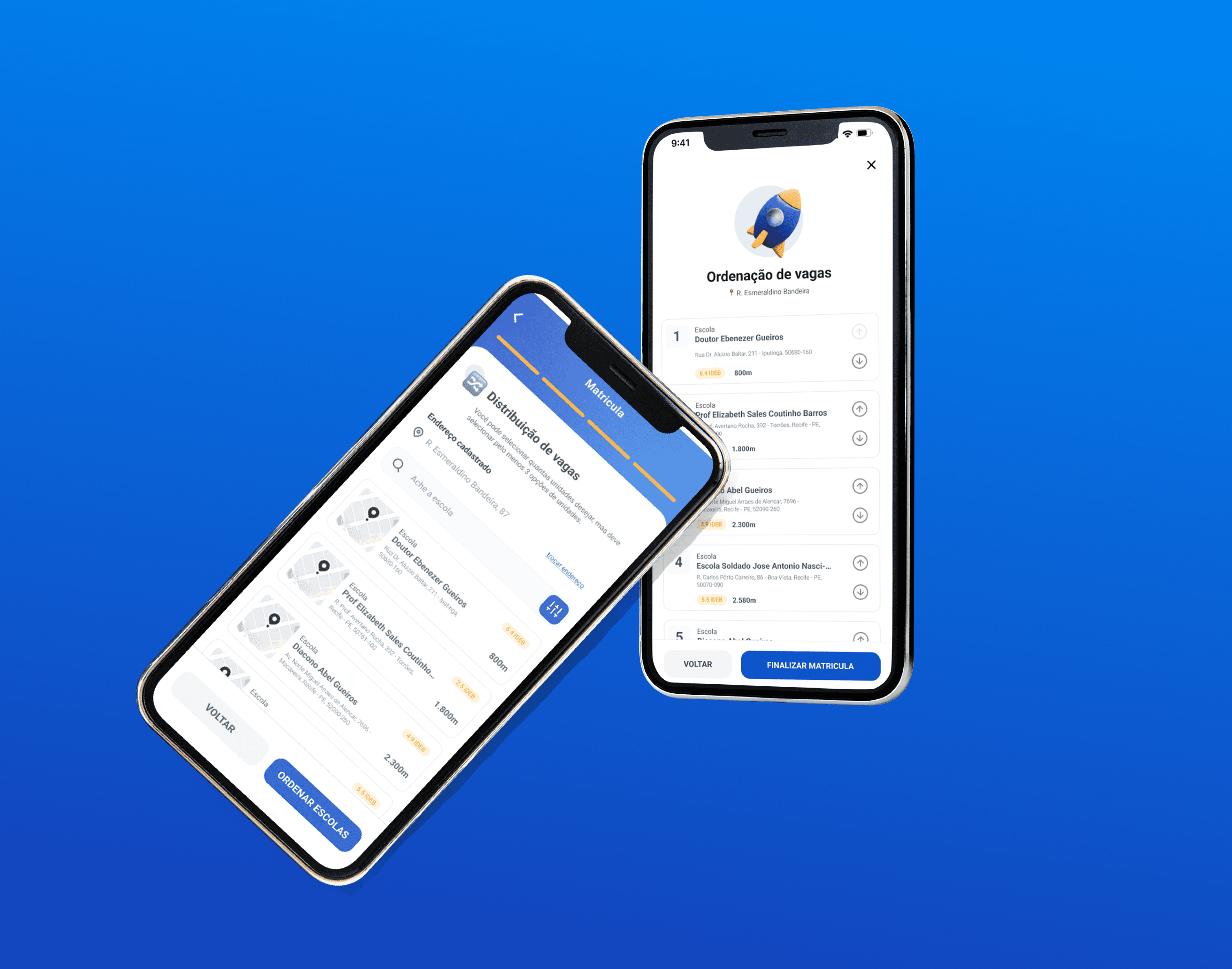
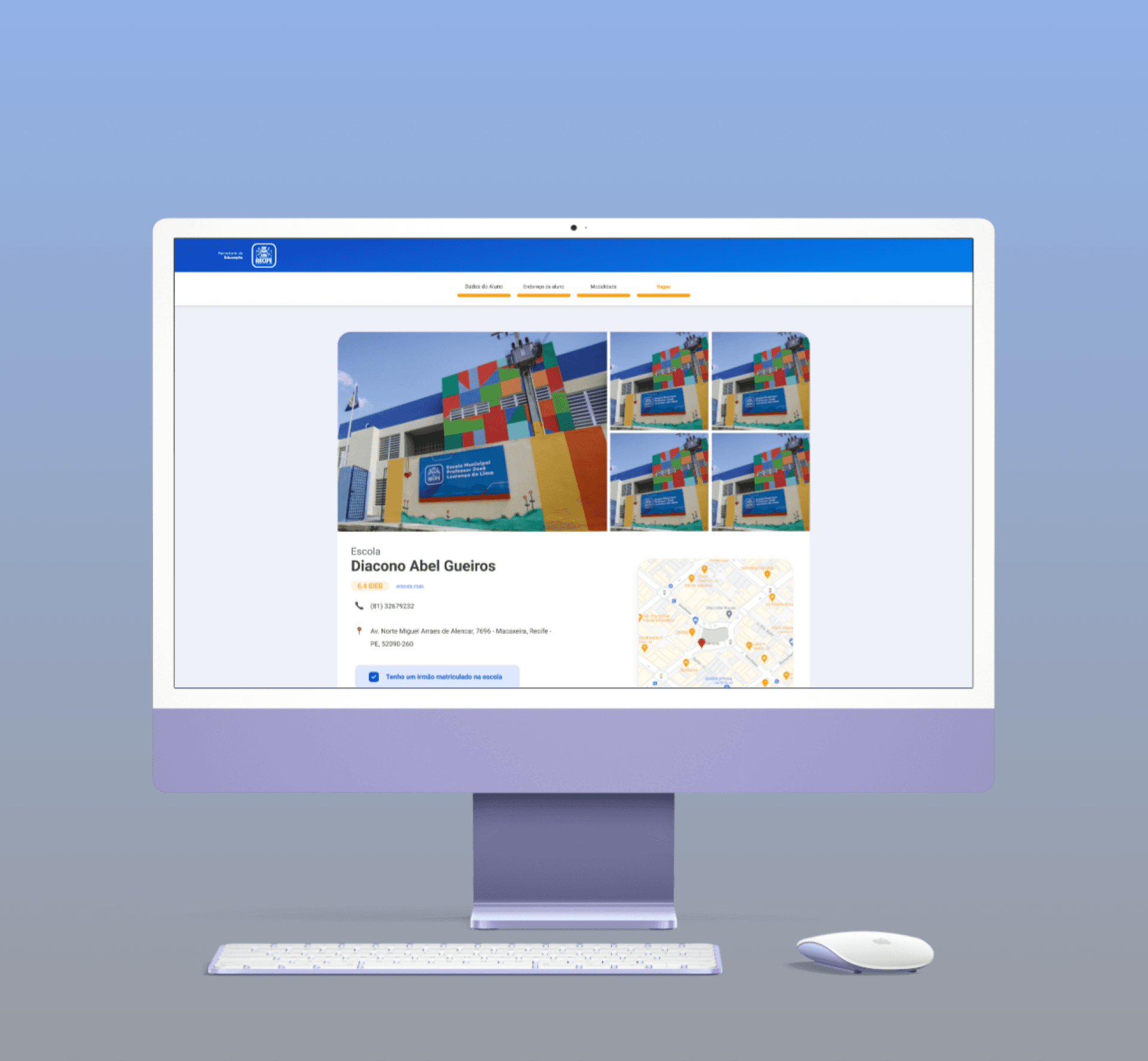
The Solution/Outcome
Designed and prototyped a simplified, mobile-first, and highly accessible digital enrollment platform. The solution focuses on intuitive navigation, clear visual guidance, and streamlined processes, directly addressing the critical needs of parents, including those with limited digital literacy, to ensure equitable access to public education vacancies.
Research
Using quantitative data (20K+ vacancies, 80% mobile users, 48% functional illiteracy) and qualitative interviews with parents, I uncovered key pain points:
Confusing navigation
Text-heavy, inaccessible language
Poor mobile experience
Lack of clear guidance or feedback
Persona
Maria, 38, a mother using a basic smartphone with limited data, needed a simple, clear, and mobile-accessible enrollment system to secure a school spot for her child.